Let's Make a Submarine Crest Tier List - LA/Seawolf Class
Part two of a multipart series on submarine crests
Like many of the customs of the United States Navy, the practice of designing individualized crests for naval ships came from the British. The first exposure most sailors have with their boat’s crest is when they hurriedly google “USS ______” in the parking lot of prototype when they finally get their soft orders (if they aren’t confronted with a Navy Times article about their future CO being fired and terrible ship’s morale). The Crest plays a prominent role in the boat’s decor, the boat’s swag, the boat’s post-deployment brief – all of the most important facets of real submarining.
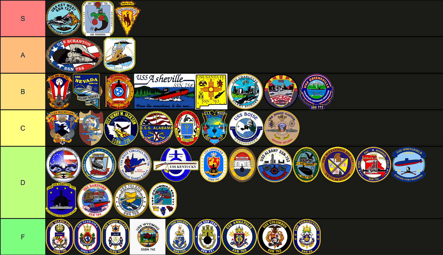
Like the boats they represent, not all crests are created equal. A good crest should be 1. Unique, 2. Bring a unique aspect of the boat’s namesake into the design, and 3. Not too busy. Let’s continue with LA/Seawolf class.
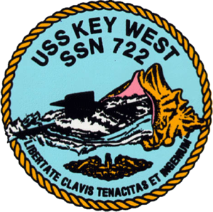
USS Key West SSN 722 - S tier
S tier for the sole fact that this is the only Submarine Crest to depict coitus. It begs the question, why haven’t other boats followed suit?
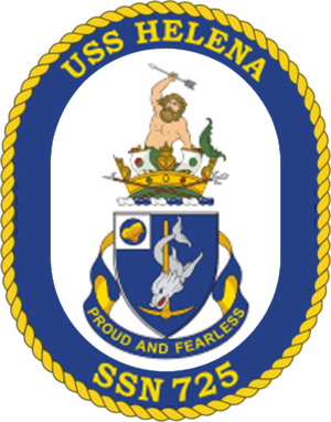
USS Helena SSN 725 - F Tier
Proud and Fearless? More like Loud and Gearless. They almost escaped their F tier prison, brought upon them by the traditional naval heraldry design by having an absolute snack of a man on top of the coat of arms.
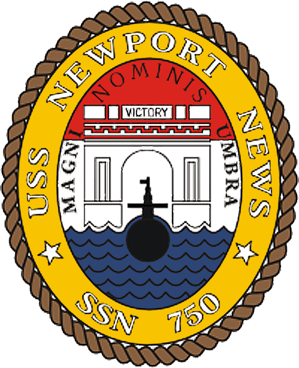
USS Newport News SSN 750 - D Tier
Anything associated with Newport News, Virginia in any way whatsoever is inherently bad.
USS San Juan SSN 751 - F Tier
Unfortunately, SPG was unable to confirm the rumors that the USS San Juan commissioning committee outsourced the development of the boat’s crest to an 8 year old.
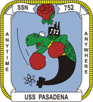
USS Pasadena SSN 752 - S Tier
Frumpy the turtle is badass, and hearkens back to the former USS Pasadena, CL-65, much better than just slapping an old ship in the background of the crest. Frumpy was actually a snapping turtle that rode with the ship for several underways until he (in true submariner fashion) grew too large to continue sailing on the boat.
Also, criticality can occur anytime, anywhere.
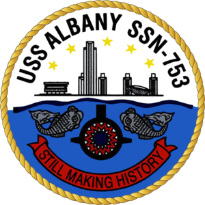
USS Albany SSN 753 - D Tier
Overall a pretty plain design. The Demogorgon mouth on the bow of the Sub is a nice touch, but overall not too much to make it stand out. The ship’s motto begs the question - when did the Albany ever make history? Maybe we’re just not read into that program.
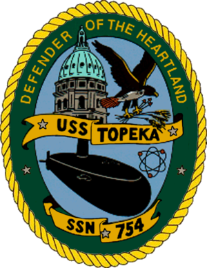
USS Topeka SSN 754 - D Tier
It’s Green I guess.
USS Scranton SSN 756 - A Tier
Trains are bad ass. The only way this could be any better is if Michael Scott’s face was on the crest and if their slogan was “Scranton: The Electric City”
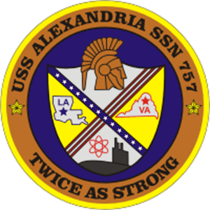
USS Alexandria SSN 757 - D Tier
A logo that makes you say, “There’s a city named Alexandria in Louisiana?” About the only thing interesting in this crest. The Bronze outline is unique at least.
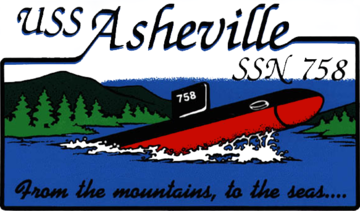
USS AshevilleSSN 758 - B Tier
Bonus points for the Asheville for conducting an EMBT Blow well inside of restricted waters.
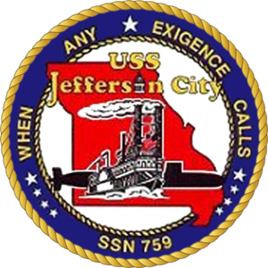
USS Jefferson City SSN 759 - D Tier
What the fuck does ‘exigence’ mean? Don’t google it, I’ve got it for you. It means lame submarine crest design.
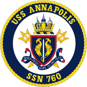
USS Annapolis SSN 760 - F Tier
“The traditional ship’s crest design is boring, and a Naval Academy graduate who calls himself an author on linkedin might write a proceedings article arguing that that’s actually a good thing. While it hearkens back to a simpler time when you could smoke cigarettes on watch and you didn’t have to spend your entire offgoing working on a BMR, do you think your Sub Ball date is going to be impressed when you let them wear your USS Annapolis sweatshirt?” - Members of SUBPAR who didn’t go to the Academy.
“You hate us cause you ain’t us” - Member of SUBPAR who did go to the Academy.
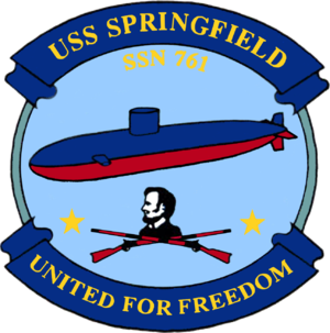
USS Springfield SSN 761 - D Tier
This looks like some shit I would doodle during EDMC’s Engineering Watchstanding Principles training.
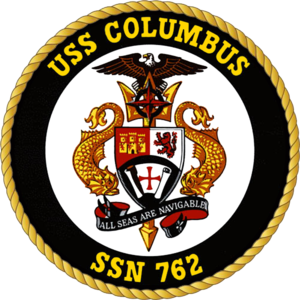
USS Columbus SSN 762- F tier
Snore. Next
Fun fact: The designer chose “All Seas Are Navigable” as the quote to use from Christopher Columbus’s journal since everything else was about exploiting the natives or being lost at sea. It was also said by my Quartermaster during his first watch as he recommended a course directly at an IA.
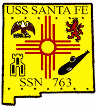
USS Santa Fe SSN 763 - B Tier
We like crests which incorporate the shape of states.
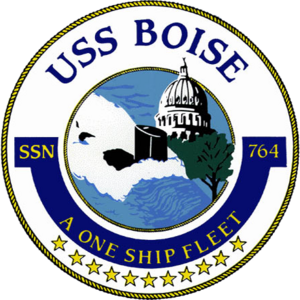
USS Boise SSN 764 - C Tier
A C-Tier crest for an F-tier ship. It’s unique in that it shows the apocalyptic future where global-warming caused sea level rise has caused flooding of the city of Boise, Idaho, sitting at 2700’ above Sea Level. There is one star for each year Boise has been tied to the pier in Norfolk waiting to someday go back out to sea again.
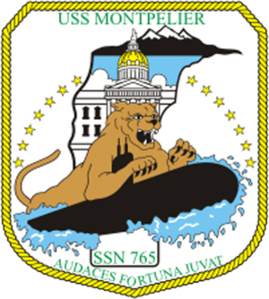
USS Montpelier SSN 765 - A Tier
A bobcat riding a submarine like a surfboard is bad ass. A more accurate outline of the state of Vermont in the background would make this better. Not sure what went on there.
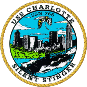
USS Charlotte SSN 766 - B Tier
Does your A-Gang Chief look like he knows what a JPEG is? What this crest lacks in graphical fidelity, it makes up with a cool depiction of the Charlotte skyline.
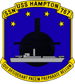
USS Hampton SSN 767 - D Tier
Unfortunately, SPG is unable to confirm that the Hampton commissioning committee licensed the work of the same 8 year old that designed the USS San Juan crest.
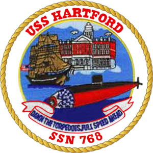
USS Hartford SSN 768- D Tier
Obviously the reviewers of this crest ignored the all time great advice of “if you see something, say something.”
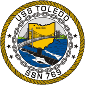
USS Toledo SSN 769 - D Tier
Many people know that Ohio and Michigan once fought a war over the city of Toldeo, but few know that Michigan actually won. SSN 769 should cut ties with the rust belt city and redesign a crest centered around Toledo, Spain.
Thankfully the crest shows you where Toledo is, because we certainly didn’t know.
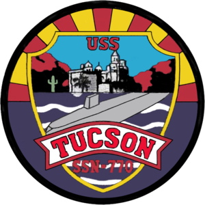
USS Tucson SSN 770 - B Tier
Incorporating the Copper Sunset of the Arizona state flag is a great aspect of this crest. But the low-poly submarine looks like a bathtub toy for a child.
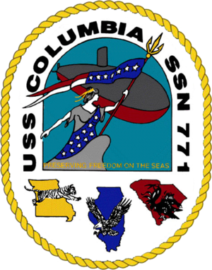
USS Columbia SSN 771 - D Tier
The best thing going for this crest is the incorporation of the different city of Columbia’s… spirit animals? It gives the energy of Rod Kimble from Hot Rod calling the souls of the Animal Kingdom for support prior to his big jump. However, calling the souls of the animals of the Spirit of Columbia will not help you out on your final evaluated watch.
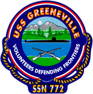
USS Greeneville SSN 772 - B Tier
Did you know that Greeneville, Tennessee is the smallest city to have a ship named after it? Unfortunately none of its 15,000 residents is a good graphic designer that could make a better logo.
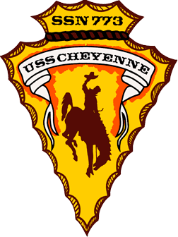
USS Cheyenne SSN 773 - S Tier
You won’t need to explain to your Tinder date what it means to be a member of God’s Boat, wearing a sleek quarter zip with this S-Tier crest on it will do all of the talking and leave them wanting to “Ride the Legend” after you pick up the check at Olive Garden with your Amex Platinum.
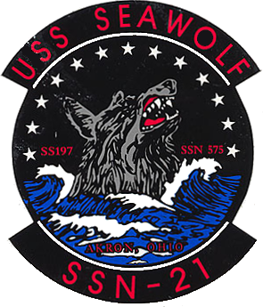
USS Seawolf SSN 21 - A Tier
There’s so much to love about this crest. However I cannot get over the fact that the wolf looks like it is drowning, keeping it from S tier
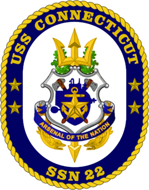
USS Connecticut SSN 22 - F Tier
The bow of the USS Connecticut isn’t the only thing that needs to be redesigned.
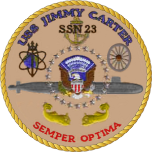
USS Jimmy Carter SSN 23 - C Tier
[REDACTED]
Contact your SSO to see if you are cleared to get read in to see this review. (You probably aren’t)




I was XO when the crest of Jefferson City was designed and your comment hits quite close to home. When the skipper first presented to the crew one of our nukes asked why English and Latin were mingled in the motto.
Where went the good ship Norfolk? The motto Vi Per Concordium was soon turned to Viper Con Corduroy , pidgin Latin for trouser snake.
Yes, you may ding me for having 2 NUCON in my life, but when you want a family life and your first five commands would start with USS without some PCU scattered in there you deal with the exigence.